Losing the plot: Let’s stop visualising everything with bar charts


By Michael Lam, Mel Hyde, and Barbara Masser
You have just finished analysing your data and you’re keen to show the world what you found. Data visualisation, graphically representing information or data, is key to describing your findings to others. How do you present your findings? People typically use bar graphs (a.k.a. bar charts or bar plots) to visualise their data in which the relationship between numerical (i.e., number of times something occurs) and categorical (i.e., category, type or group) data are plotted vertically or horizontally as bars. However, there are many plots you can choose from and bar plots are not always the best way to visualise data.
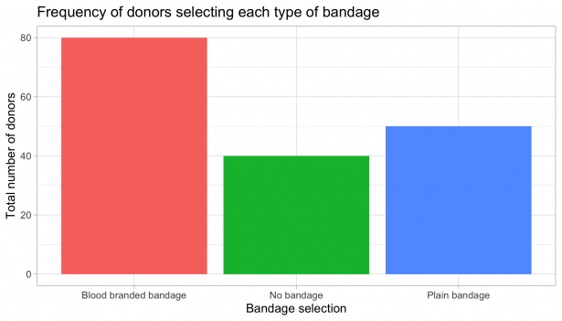
Let’s start off with what a bar plot actually does. Bar plots are used to represent the numerical value of a category. The height of each bar represents the absolute value (e.g., quantity, amount) of the category. For example, say you collected data on the type of bandages blood donors chose to wear after their donation. To visualise this, you could plot a summary of the total number of donors selecting each type of bandage. The bar plot does a good job in this instance as it accurately shows the count across each category.
But now, what happens if you are working with continuous outcome data? Continuous outcomes refer to data that can take any value within a range. Sticking with the bandage example, let’s say you have data on the degree to which other people think the bandage wearer is generous. To visualise this, the data would need to be summarised by plotting the average rating (i.e., mean) that people gave to indicate their perception of the generosity for each bandage wearer. To accompany the mean, we also need to provide an indicator of uncertainty – how much the average value varies in each category (i.e., variability). The common method used to represent variability is either the standard deviation, standard error, or 95% confidence interval.
So, what is wrong with using bar plots for continuous outcomes?
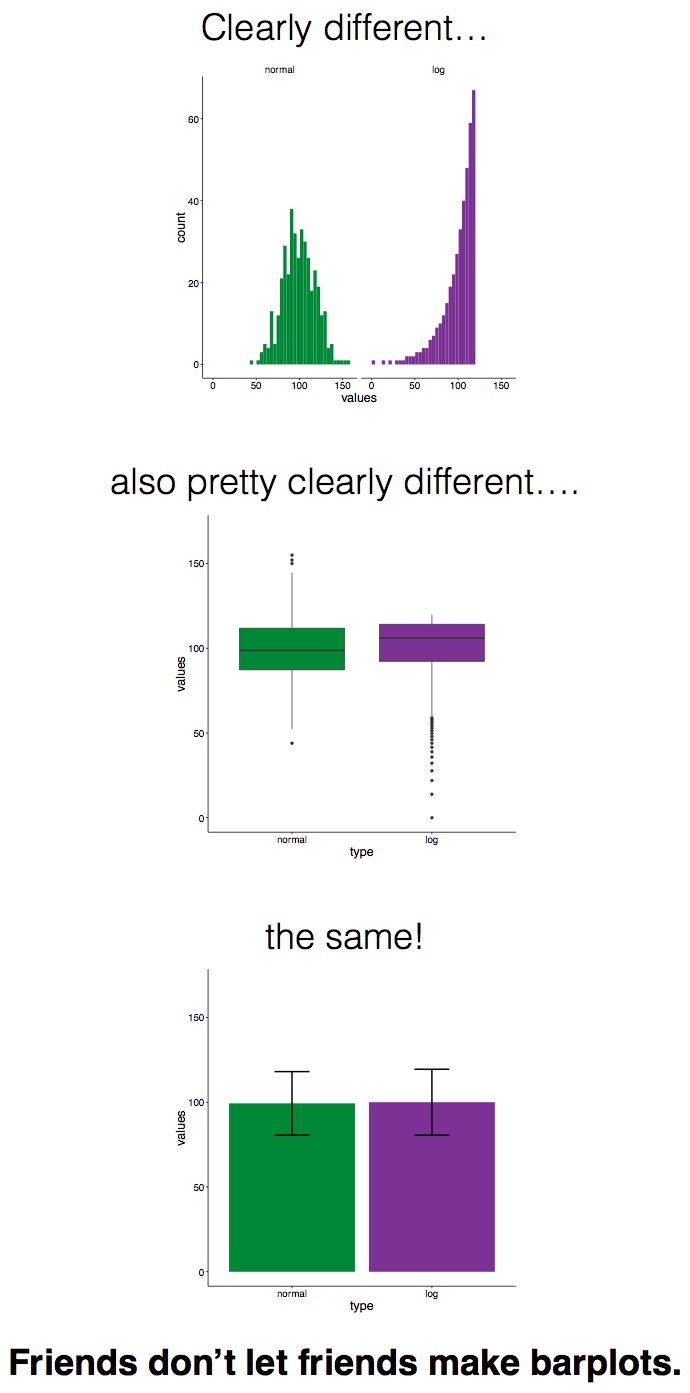
- The ‘bar’ is misleading. People typically use the height of the bar as an indicator of the mean. But think about what you are doing here, you are averaging across all responses in the category to get a single value and plotting this as the height. Not everyone is selecting the average value and you are also hiding what people are selecting. While you can use error bars to represent the variability in people’s responses, studies show this does not help at all. People are likely to show what is called the within-the-bar bias – that is, they think that all values fall within this range. This bias occurs even if you add error bars to your bar plot.
- The bar hides the distribution of the data. What if you wanted to know more than the mean. Imagine you are considering questions such as: What are the minimum and maximum values? Could the mean be skewed (i.e., distorted to the left or right of a normal distribution) by an extreme value? How many responses are there in each category? The chances you will be able to answer these questions are quite slim when all you see are rectangular boxes.
None of this is new. Many research papers and blogs are encouraging people to stop using bar plots to represent continuous data. A few years ago, a group of young scientists started a movement called #barbarplots to promote using more transparent plots instead of bar plots. We know what you are thinking, so what should I use instead?
Losing the plot – alternatives to bar plots
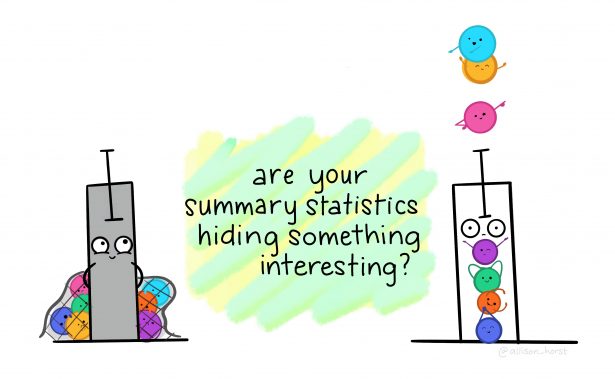
The good news is that there are plenty of alternatives that you could use to visualise your summary statistics. To name a few, there are box plots, violin plots, and raincloud plots. We will focus on boxplots and use some of our own data as an example of how you could visualise your data more transparently.
Example
In our published paper last year, we found that participants rated the target wearing a blood branded bandage to be more generous than when they wore either a plain bandage or no bandage. First, let’s plot this data using a bar graph. The height of the bar graph corresponds to the mean and the error bars represent the standard error (Figure A). Next to this, we plot the same data using box plots (Figure B). The raw data points (transparent circles) are shown to help illustrate the interpretation of the boxplot.

Looking at the plots, you should see that the box plots in Figure B clearly show more information about the data than the bar plot in Figure A. In the bar plot, all you can really see is the mean value. Looking at the box plot, you can see both the median and mean. The box (i.e., interquartile range) also shows where 50% of the data points fall. Lastly, the minimum and maximum scores are displayed along with any outliers (i.e., a data point that lies outside the rest of the distribution).
Using just this one example, we hope that we’ve convinced you that we can all tell better stories with our data by using appropriate plots. Losing the (bar) plot and using an alternative plot to visualise data can help us better understand and communicate about data. We’ll end with this popular meme by Page Piccinini which nicely sums up the problem with bar plots. Make sure you tell your friends…